Tip 01
Favorites aren't always finalists.
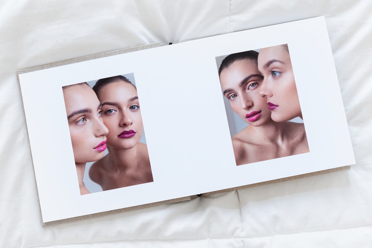
Your favorite images aren't always the best examples of your technical abilities. Before including every single one at the expense of your other photos, ask yourself "what's the purpose of this portfolio?" and "who's my audience?" Thinking through this lens doesn't mean second-guessing all of your selections, it merely just means keeping the end goal in the back of your mind as you curate. After all, chances are you're creating this to win clients or apply for a program. In some instances, that could mean narrowing your focus, while in others, it might mean showcasing a more diverse selection.
Tip 02
Think in stories.

You're trying to showcase different concepts, approaches, or focuses within the same book — all the while creating a cohesive narrative. In a portfolio that might showcase years worth of work, weaving it all together with a common thread can feel like a tall task. Take a look at the various shoots in your body of work and think through the stories you see. Is there a larger theme or story that runs through these collections? Once you identify it, use it to help guide the layout, order, and any keep-or-cut decisions you face.
Tip 03
Leave a little breathing room.
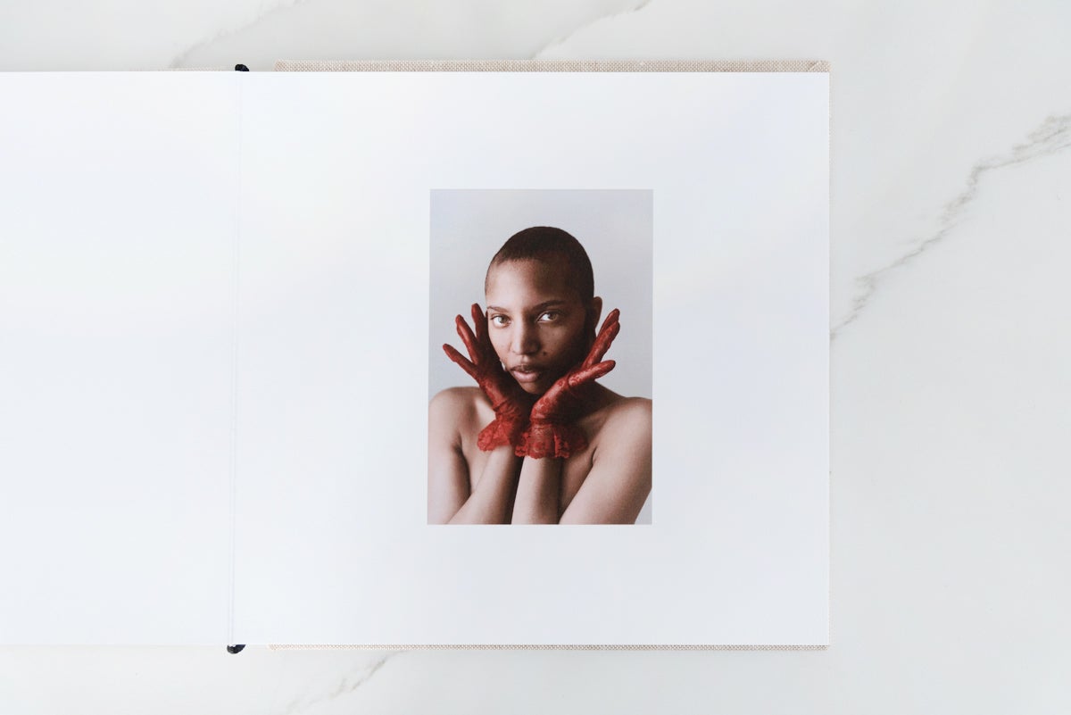
It can be tempting to sacrifice space for more photos — but to ensure that your audience becomes fully immersed in each image, let them breathe. By using negative space in ways that minimize competition, your audience is able to get lost in the photo, giving them a chance to notice the subtle details that make it remarkable.
Pro tip: Don't be afraid to take a full two pages for a select number of hero images you want to make sure get the attention they deserve.
Tip 04
What's the focus?
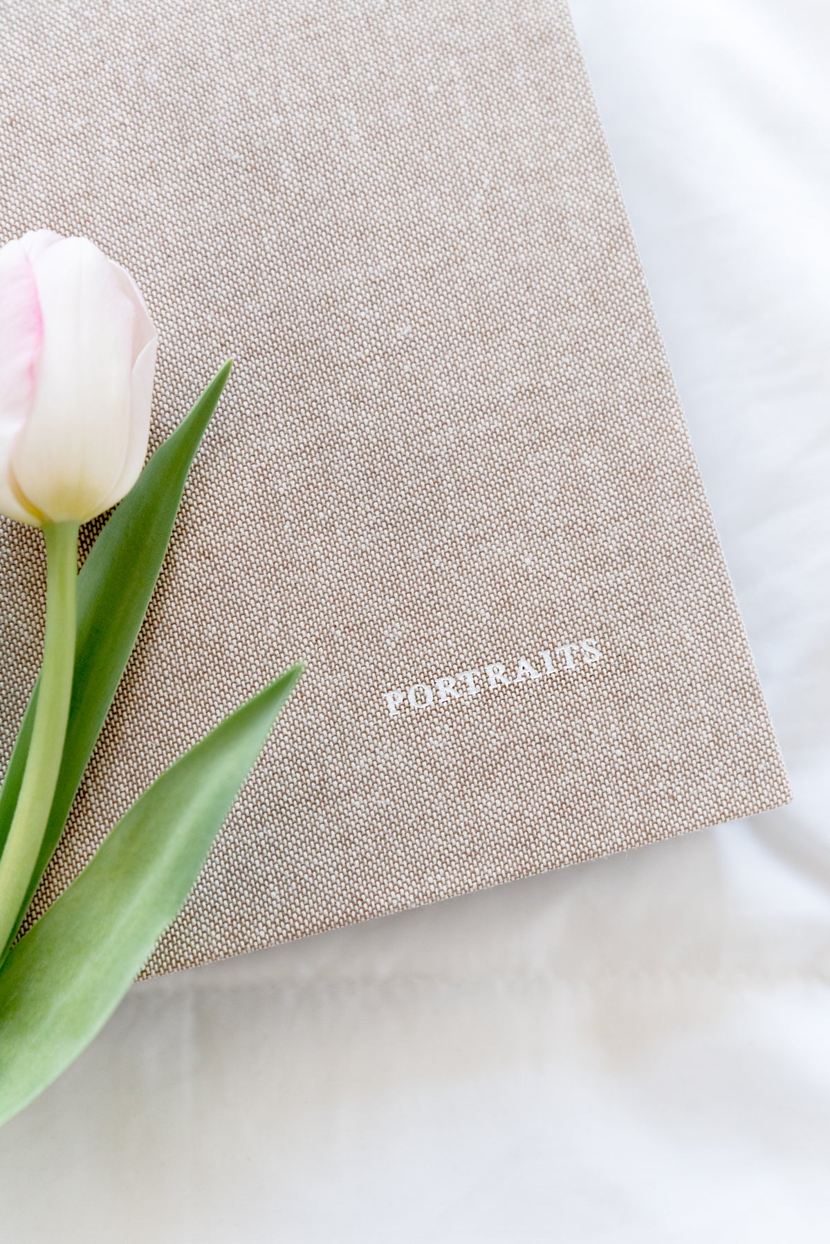
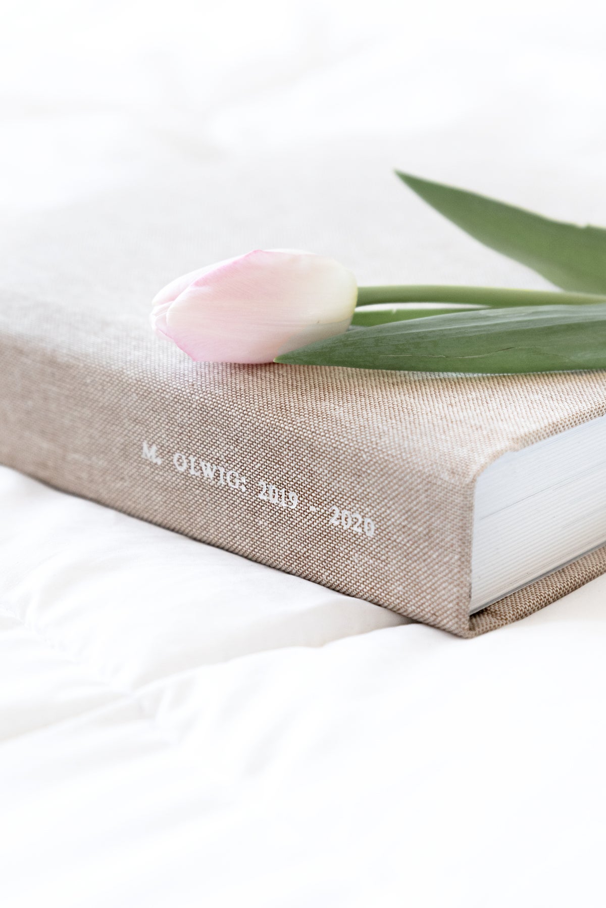
What you leave out is arguably just as important as what you include. More often than not, cropping out the pieces that feel like they might not fit will lead to a tighter end product. Step one is determining the scope and focus of your featured work. Whether you choose to double-click into a specific year, focus exclusively on portraits, or create an entire book around a single shoot, this decision is key to determining what stays and what goes. Your audience won't know what you cut, but they might just pick out the photo you weren't quite sure whether or not to include.
Tip 05
It's all about composition.
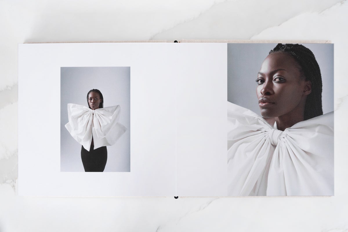
Approach your portfolio in the same way that you would approach photo-making: be thoughtful in your composition and direct the reader's focus where you want it to be. Just as in a photo, every element included in your portfolio should pull its weight with a unique contribution to the big picture. The spacing between photos and the layouts you choose for each can also go a long way in directing the viewer's eyes.
Tip 06
Set the scene.

Before you dive into the detail shots, it's helpful to set the scene with a panned out image that gives context to the images that follow. Think of it like flying into a new city: before you see any of the individual sites during your stay, you look out the window and see the destination from up high. Lead with a look out the plane window to gently ground people in their new destination, then take them around and show them the sites.
Tip 07
Get feedback.
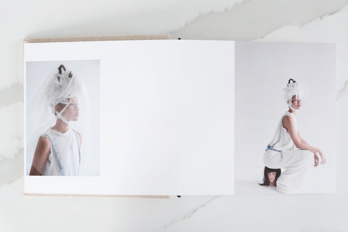
No portfolio lives in a vacuum — you're creating it for people to see it and interact with it. Before making it final, get a sense of what those interactions might look like by seeking feedback from a mentor, colleague, classmate, or peer. Let them know what made the cut and what didn't, because their insights aren't influenced by the same attachments you have to your photos. Just remember: no matter the advice, it's your call in the end!
Tip 08
Choose the right book.
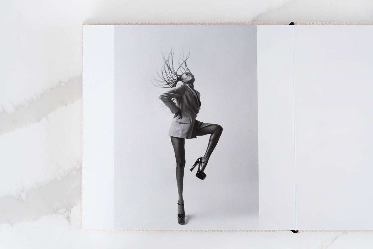
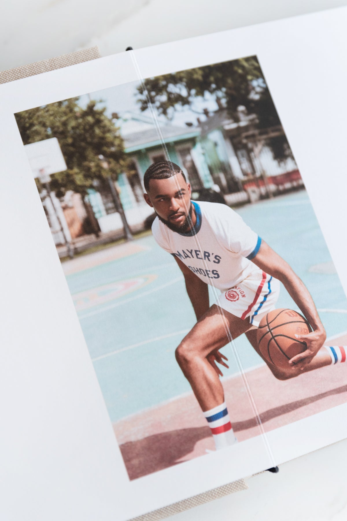
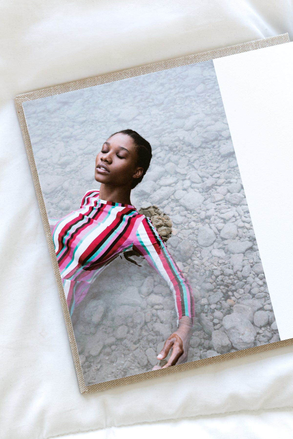
Once your image hits the page of a book, the way in which people interact with it changes. It becomes a tactile experience, made more fluid by the photo book itself. For instance, choosing one paper finish might enhance photos with a glossy, reflective sheen — while choosing another could mute their colors, making them gentler. The thick, unbending pages of a Layflat Photo Album may keep the curve of the page from distorting the photo, but that same distortion might amplify the effects of shapes and forms printed in a Hardcover Photo Book. In choosing the specifics of your book, you're also changing the experience of engaging with the photos.
Bonus
Flip through.
Find inspiration.
Looking for photography portfolio book examples? Take a page from our Lead Photographer, Molly Olwig, who created hers using our Layflat Photo Album.


