When decorating, renovating, or refreshing a room, nothing quite stares you dauntingly in the face like a large empty wall. With so much blank space to furnish, one might immediately resort to a single large frame or a full gallery of art and photos. But before you resort to other wall art ideas, consider one that may not first come to mind: triptych photography, or split photo frames. It might sound elaborate, but here we'll break it down into approachable tips that can help you create your own.
A Guide to Your New Gallery Wall
How to Split a Photo Into Multiple Frames
What Is a Triptych Gallery Wall?
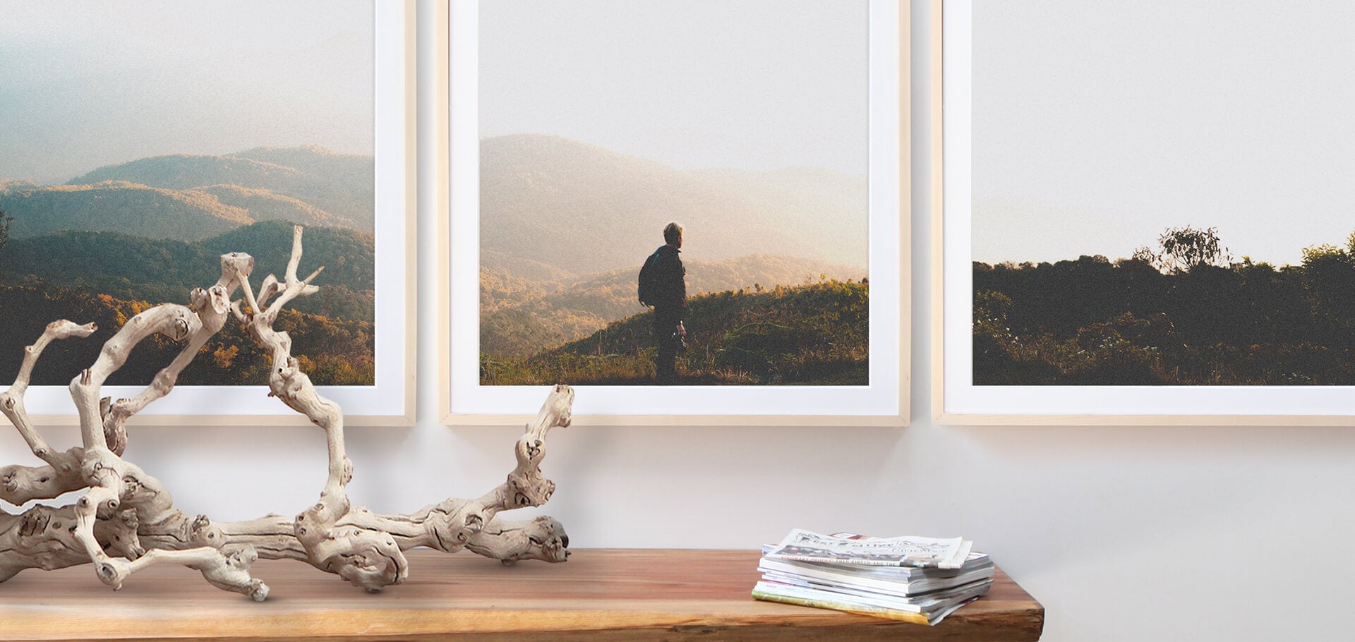
This creative method of making wall art is achieved by splitting a photo into tiles or separate panels, so that two or more images compose the whole, together. For example, think of it like a very basic jigsaw puzzle, but instead of odd shapes, each "piece" is simply a rectangle or square. This way, you're able to frame each image or print it onto canvas to display.
Because they're often done in three panels, you may hear of and opt for creating a "triptych" — and that's specifically what we'll cover. The tips and steps you learn for a triptych gallery wall can easily be applied to a photo split into two, four, or more, once you know the basics!
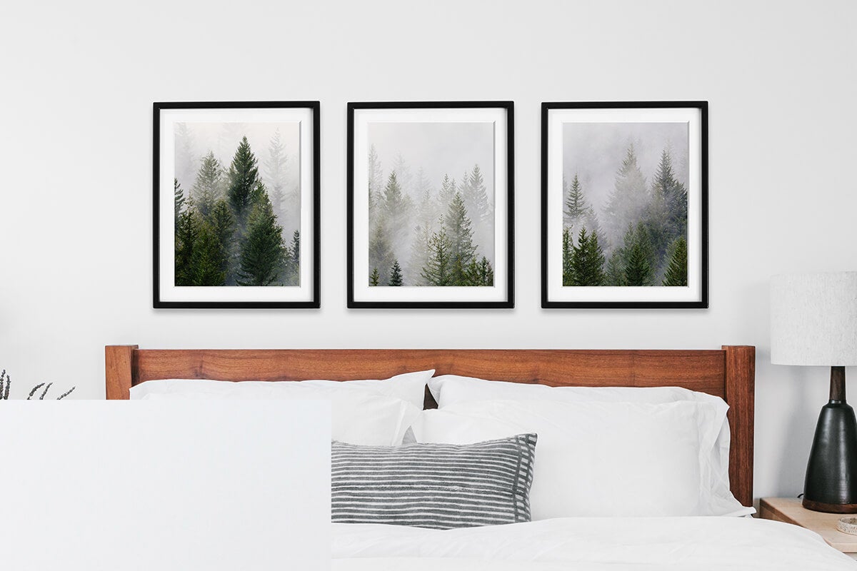
Finding Your Photo
When shooting specifically for use in a triptych, there are a couple of key photography tips to keep in mind:
Resolution
It's paramount to keep resolution in mind as you build out a triptych, always aiming high. As reference, most photos from your smartphone, Facebook, or Instagram are automatically set to web-viewing resolution of 72 DPI. But you can always change the DPI of your photos to see how big you can go at print quality.
300 DPI is generally considered a high-quality print resolution (known as giclée), so for large format frames, mobile photos will have a hard time achieving the split effect at scale.
However, you can create a triptych of any size! Photos from your smartphone can be used if you want to create the continuous image illusion with smaller frames, like 5 x 7" or 8 x 10", which work great for walls with less space or smaller nooks of the home. Anything bigger than that will require a larger, higher quality image. (Time to dust off that DSLR, if you have one!)
Rule of Thirds
When considering how your photo is framed and where key points of interest lie, it's important to remember the rule of thirds. For example, placing a horizon line in the upper or lower third of the viewfinder, or orienting your subject slightly off center, will encourage the viewer's eye to move within the frame. Breaking the subject into three parts ensures that each frame can stand on its own, while working as a unit together.
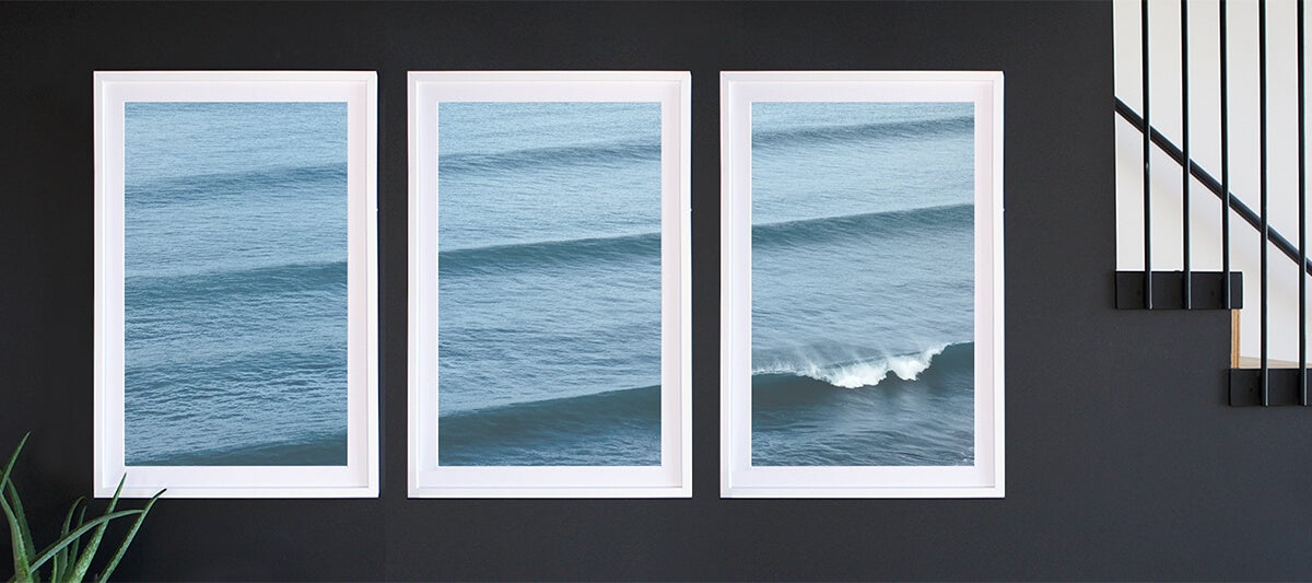
Stitching Photos
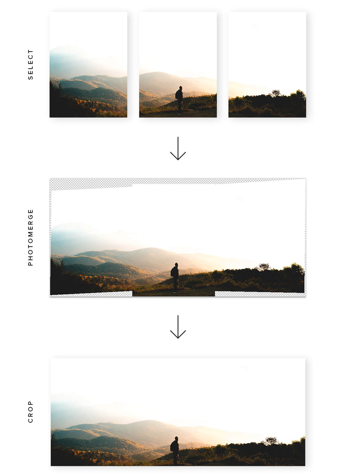
It's sometimes difficult to break one photograph perfectly into three parts, and finding a photo with high enough resolution to span all three frames can be part of the challenge. Instead, another solution is to stitch together three individual photos into one larger one, as long as the lighting and subject don't change.
To do so, you'll likely need to shoot separate photos from scratch, like a non-continuous panorama, giving yourself more resolution to work with. We find Photoshop's "Photomerge" tool is really helpful in blending multiple pictures into one seamless image.
Which Images Work Best?
When looking through your photo archives or thinking about the subject you'd like to shoot for your triptych gallery wall, look for horizontally oriented photos. Landscapes, whether of ocean cliffs or rolling hillsides, are great for creating visual interest while fitting thematically into a home or office setting. In addition, consider cityscapes as the subject of your triptych; their geometric elements and architectural details find success in this format, drawing the eye from one panel and connecting it to the next.
Landscape or otherwise, horizontal visual interest is the goal. Graphic elements that can span across frames or canvases, whether they're two, three, or more panels wide, are what give split photo decor its allure.
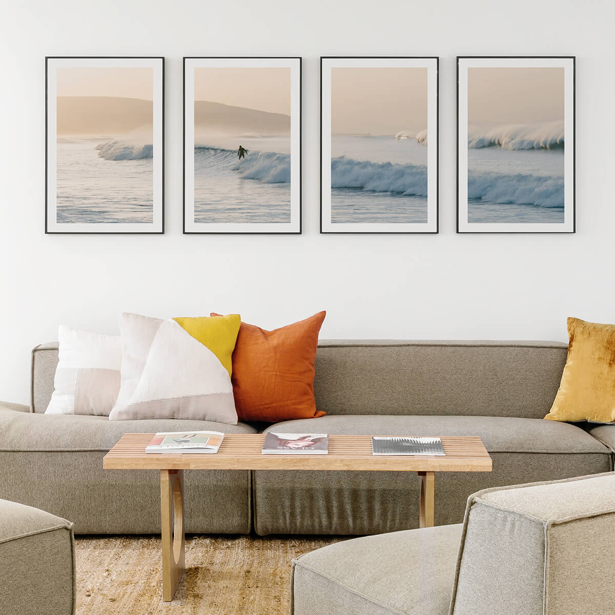
Editing Your Photo
With triptychs, it's all about continuity and clearly creating connecting elements that span across frames. While colors and filters might be a matter of personal taste, a little contrast can definitely go a long way. The clarity, cropping, and contrast of your photos will keep them from losing the graphic visuals that tie them together.
Ensuring Clarity
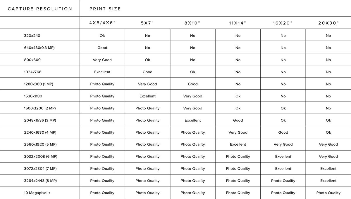
Ideally, exporting your files at 100 percent height and width with 300 DPI is the best way to ensure clarity. While exceptions can be made, we wouldn't recommend going below 200 DPI, as you'll begin to see the resolution degrade if you look up close at the images. If you need help blowing up the size of your photos, we've got just the guide to get you there: How to Enlarge Photos. The chart below can also give you an at-a-glance idea of how large you can print a given image file.
Cropping
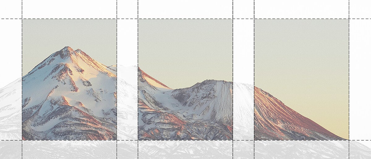
Key to breaking up your image is maximizing visual interest and continuity. We find Photoshop's artboard tool helpful for dividing your photo into thirds prior to beginning your project in our website's editor. (You crop your photo into thirds using your computer's native photo editing program as well, so don't be discouraged if you don't have Photoshop!)
Try creating each artboard to be the size of the frame, experiment with your spacing, then export at full resolution. It's fun to isolate elements within each frame to help the triptych's individual pieces feel more intentional. Making sure each frame has a point of interest, if possible, will only make the resulting effect that much stronger.
Pro tip: Keep in mind, the negative space between each framed photo will also need to serve as "negative space" that's been cropped out of your photo. By accounting for the space between frames as well as the additional distance introduced by the mat, you'll create the illusion of continuity, making the final product feel seamless.
Choosing Your Prints
Frame Recommendations
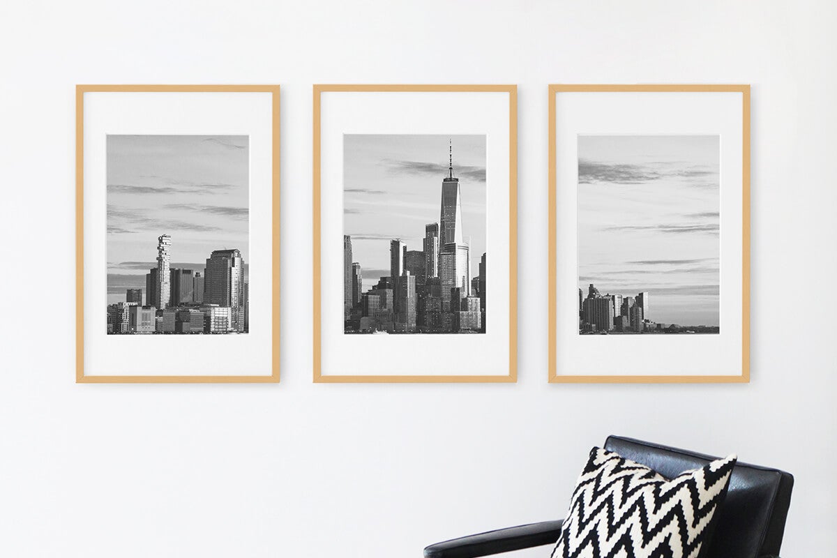
Finally, when it comes to displaying your triptych photography, the most popular method is simply framing each one to create a gallery wall. The easiest and most impactful look to go for is three of the same frames (in size and color), spaced equidistantly apart. When choosing a frame, the thinner its moulding and mat, the better. Minimizing the details and space from one photo to the next will help keep focus on the continuity of the image within it. In fact, sometimes printing these with full bleed is best for the triptych effect.
Need a hand with picking a frame? Our favorite style for this type of decor idea is the Modern Metal Frame, with it's sleek moulding, and our Gallery Frame, offering wood options with a trim profile.
Hanging & Spacing
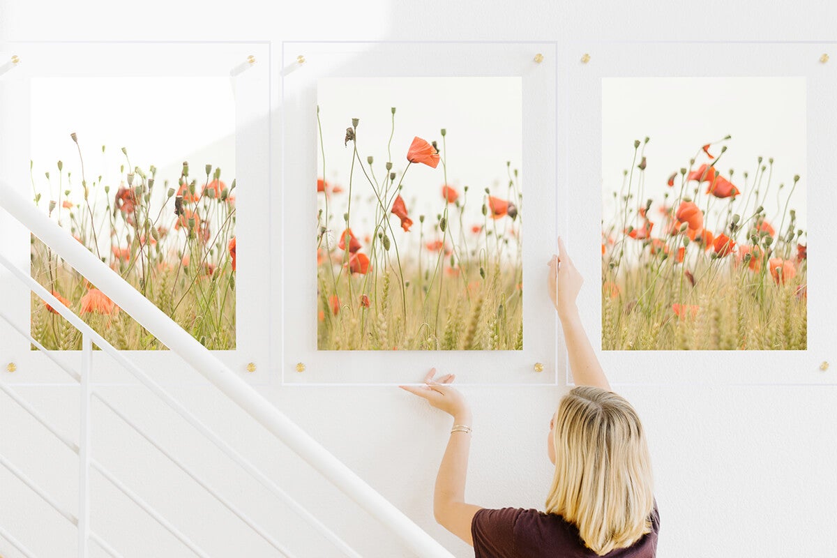
The spacing between frames is what makes or breaks their visual flow. It's important to consider how far apart you want your frames when you build the files: don't just splice the photo into thirds, because once it's on the wall with room between each frame, your lines may no longer match up. This is where playing with the layout of all three in a program like Photoshop, including the whitespace between them, will assist in visualizing how the image connects through the white space.
Whichever way you choose to to bring this idea to life in your home, just remember that there's no right or wrong way to create a triptych. It's fun to think of the possibilities, and as you're finding the right image, explore editing a few to see which you like best!
