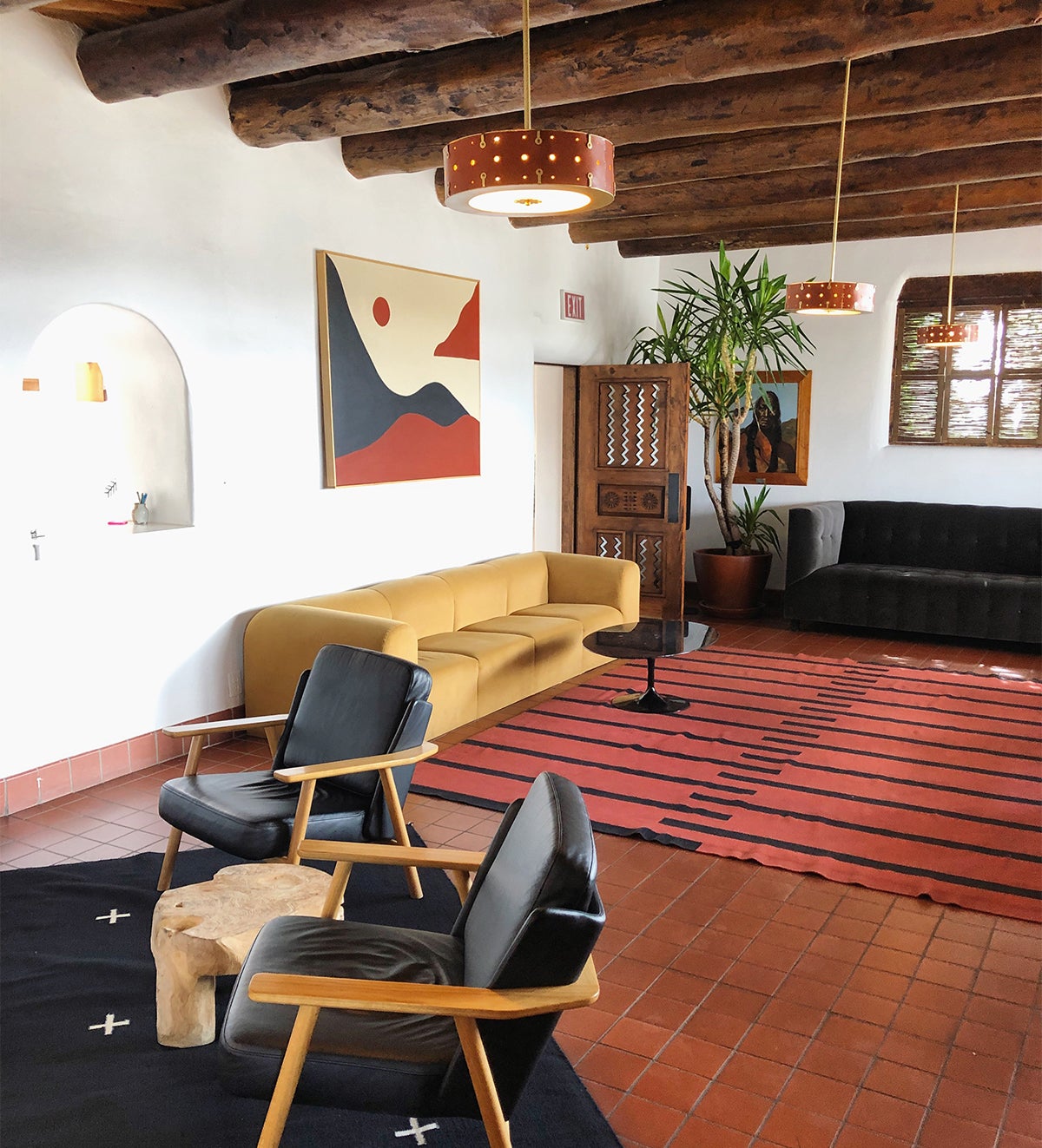
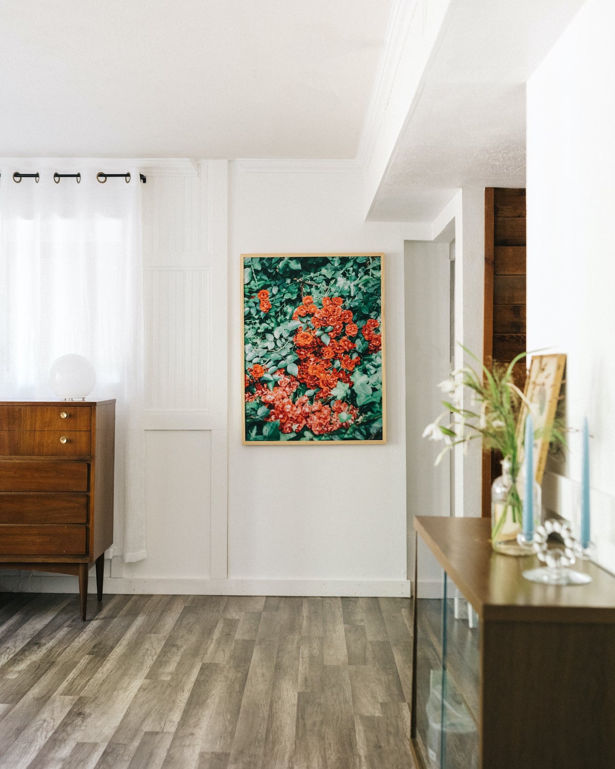
Finding minimalist living room ideas that align with your space starts with the little things that make it unique. Have rooms with plenty of square footage? Take advantage of the extra real estate by giving distance to those pieces that breathe in personality. The newfound open space not only makes rearranging and reimagining rooms simple and easy, it also opens up the flow of energy for a more relaxing result — just like @kristenswen found at El Rey Court.
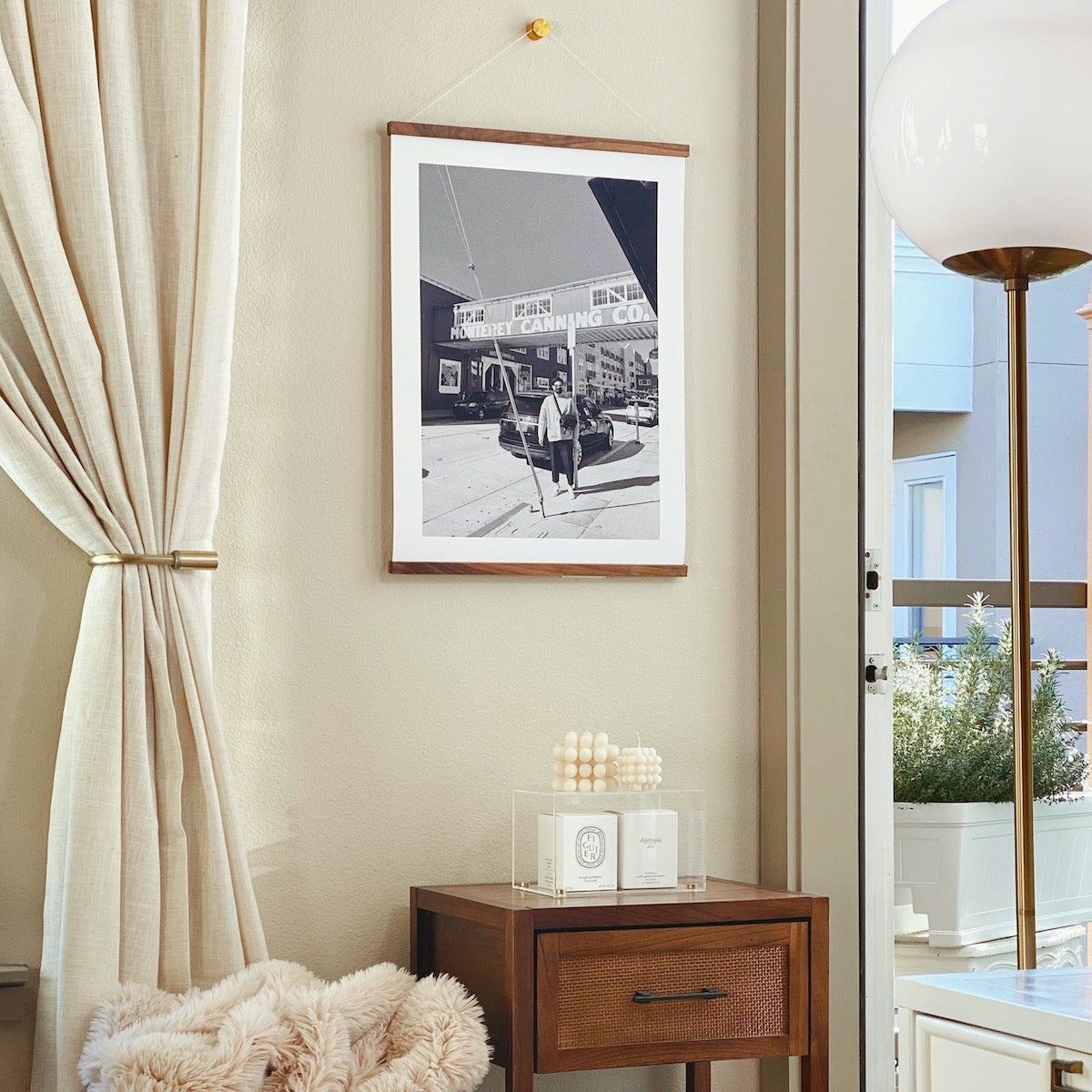
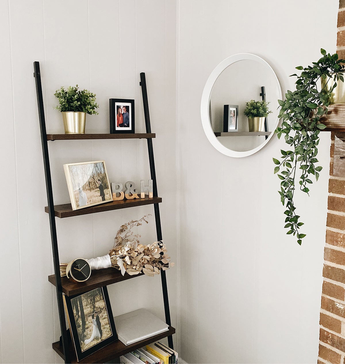
Elevating empty spaces doesn’t always mean buying new furniture or filling them to the brim. Often, all it takes is a few small pieces to liven up the little nooks and corners that feel like they're lacking. We look at it as a chance to unearth the decor tucked away in storage, reclaiming vintage pieces and finding purpose for items that feel in excess elsewhere. Giving new life to these familiar embellishments might just bring some dimension to the otherwise unused areas of your home. (Thanks for the example @guesthouseshop and @kyliefitts!)
As we fill rooms, various elements can begin to compete for attention, drawing the eye in many directions and creating a sense of disorder. One way to combat this effect is to create a couple of focal points that bring decorative pieces together into a single, cohesive element. Display shelves and wall art ideas are two such opportunities to create heroes in a minimalist room design.
As you continue to add pieces to each, ensure any new additions compliment the original vision, always designing with the whole in mind. Looks like @lagomgoods has the idea.
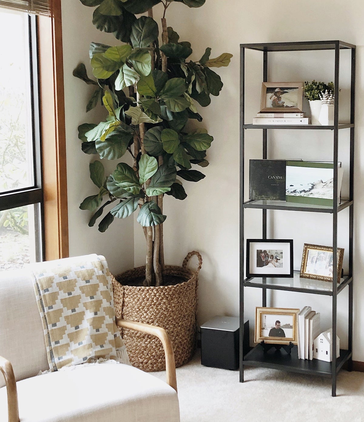
At the heart of all minimalist room ideas is the tenet of simplicity — and in that sense, the call to keep things light. Staying true to a consistent appearance and theme while eliminating excess will bring a calm yet structured appearance to your room and similar zen to your overall mood. If you do choose to add color to the space, try to stick with a neutral color palette, including small pops that stand out without overtaking the room (like the patterned throw pillow in the image above).
Keeping busyness at bay begins with careful curation. When searching for ways to refresh your space and simplify your home, ignore the intuition to purge all of your items — especially those that are most meaningful. Instead, discover decorative ways to arrange your favorite pieces and give each its own area for display. Thoughtfully spacing every item like @october_kelly is a simple way to achieve the minimalist room design you’re looking for, while still honoring those collections that are the keepers of your stories.
Minimalist decor ideas need to prioritize balance, and those that don't can often start to feel drab. Yes, less is often more — but too little can also make a room feel lifeless. That's where plants are best friends for rooms that still feel like they're lacking those little touches. Even just a couple of well-placed pieces of greenery, like those in @brianschindler's space, create a much-needed pop of color in neutral-saturated palettes. Consider it the most literal means of adding life to your space.
Pro tip: Do a little bit of research and make sure the plants you choose to grow will adjust well to the levels of light in the room.
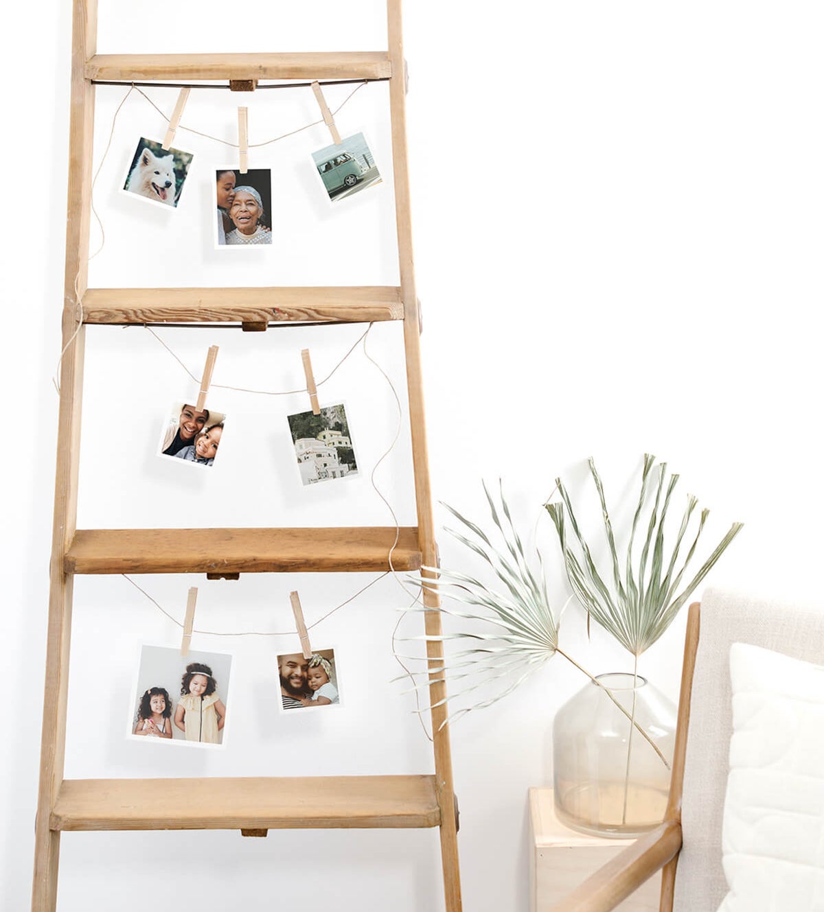
Minimalism isn't simply about doing less, it's an exercise in doing less with more intention. Incorporating fewer pieces allows us to approach the props and decorations we acquire more thoughtfully, making way for creativity that might otherwise have gone unfound. An old ladder left to gather dust originally might just be a chance to celebrate your stories and set your decor apart.
With each piece, ask yourself: What purpose will this serve? How can I utilize this in a meaningful way? Sure, we're a little biased, but we find that those pieces that play well with photos often become the standout elements in the room.
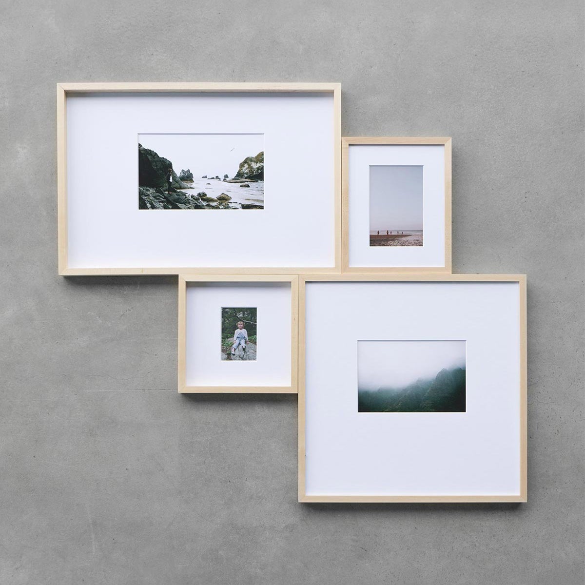
Curating a small gallery wall is an easy way to create the type of focal point in a room that we talked about earlier. You can assemble a wall like this with a small cluster of similar style frames featuring different photos. Let loose and experiment by varying the finishes and sizes… and don't feel trapped by the need for perfect symmetry (balance is ultimately more important!). In the image, the four frames strike a nice balance without being perfectly symmetrical.
Pro tip: Choose photos with similar hues, faces, or subject matter to wrap the series in story.
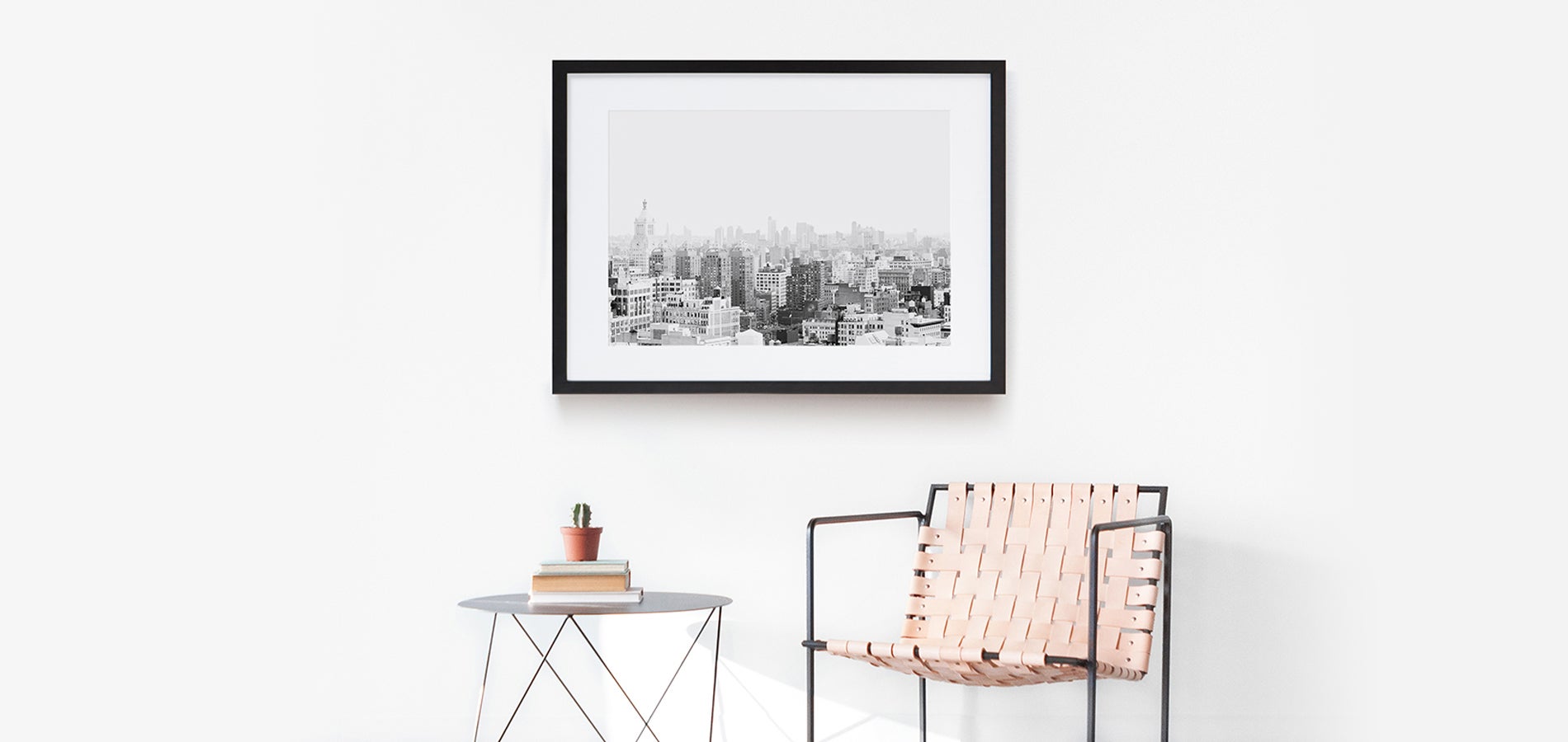
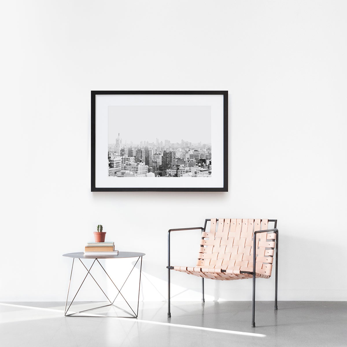
Absence often adds a little something in return — meaning that embracing negative space can create positive results for your decor. Leaving space around that statement wall decor piece, unique chair, or design-forward side table lets it truly shine and capture the attention it deserves. Take advantage of this approach to open up your space and your sense of expression in tandem.
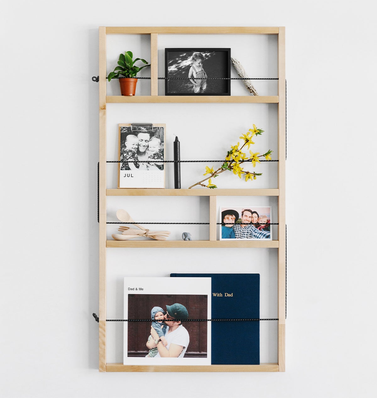
Take advantage of the organizers in your home to declutter your space and draw attention to the pieces that matter most. Keeping things clean and compartmentalized makes an immeasurable difference to the execution of your design goals. Incorporate both small and large pieces for a diversely appealing range of props.
We love the different mix of photo creations and tiny household items above. What are those little odds and ends at home you can bring together to make it feel like one?
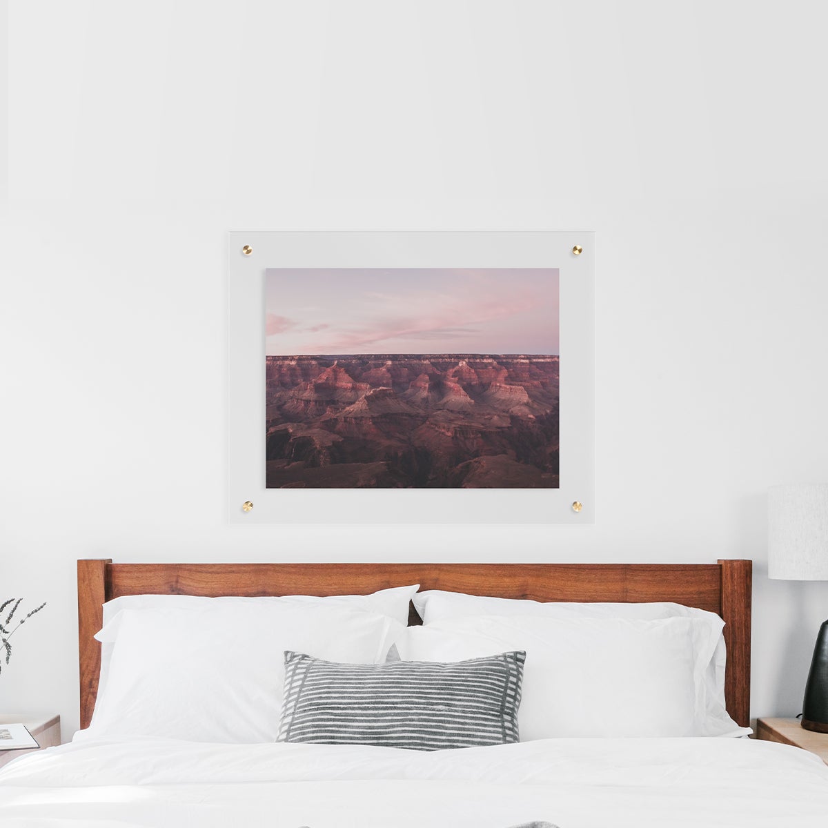
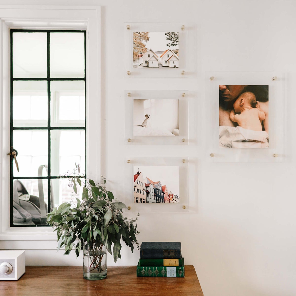
Small upgrades can make a meaningful impact to your space — even if it's just fresh frames. Minimalist wall art lets the photos take center stage, adding a subtle statement while showcasing the photos that capture your greatest moments. Transparent frames do this by nesting the image in negative space in a way that gives them depth. (We're head over heels for this take from our friend Kate Arends of @witanddelight_!)
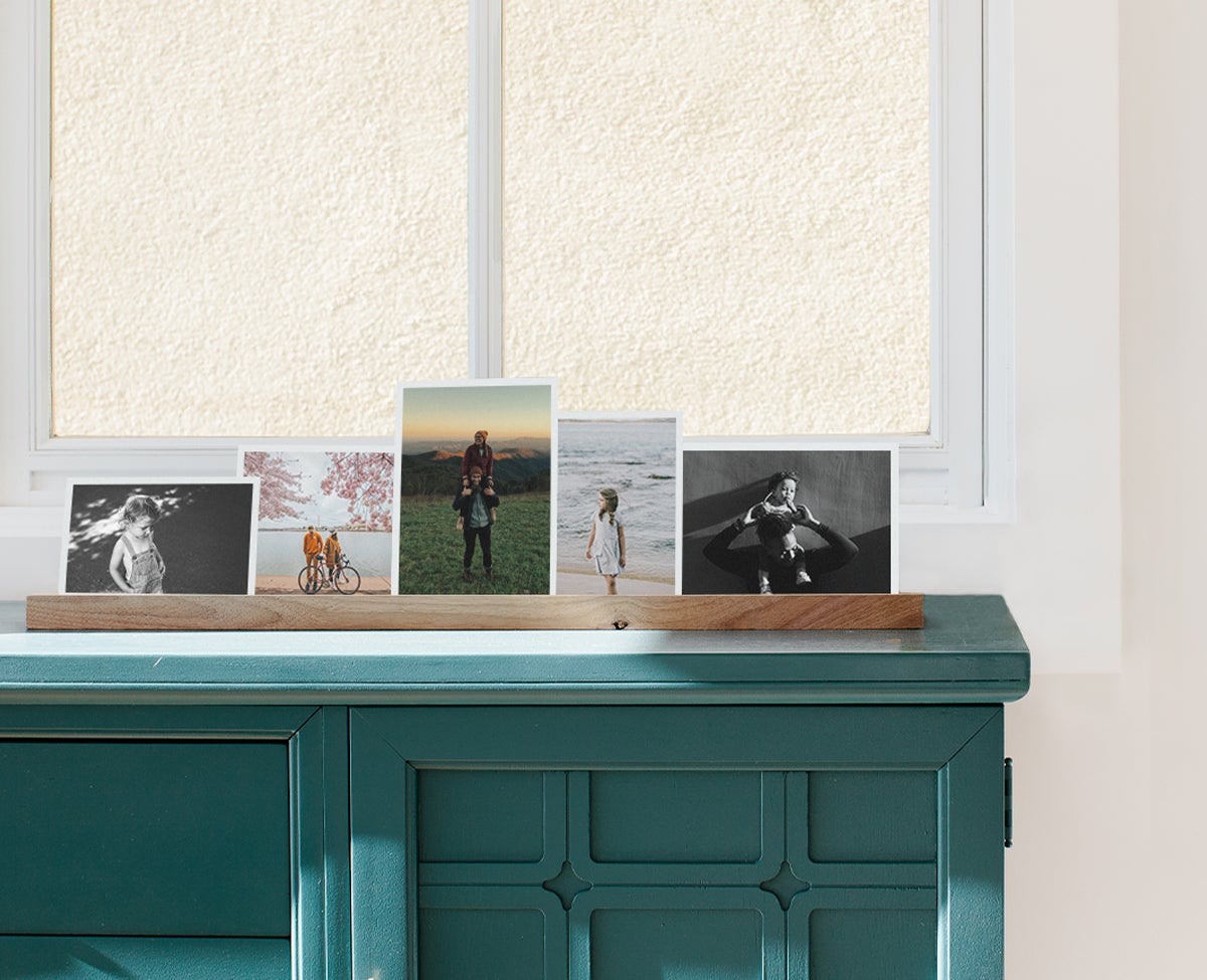
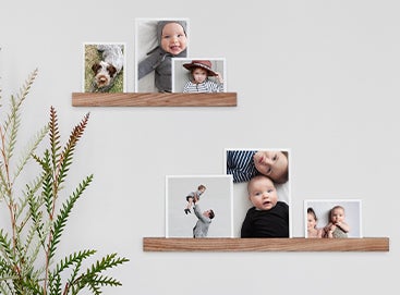
Forego any traditional notions about photo display that may limit your style, and don’t be afraid to opt for a less formal approach. We big proponents of frame-free photo holders such as the Wooden Photo Ledge, which allow for revolving display of photos, invitations, personal notes, and more. Whether you add it to a custom wall collage or keep it on a desk or dresser, its contents offer the room simple reminders of what's truly important.
Pro tip: Mix and match different ledge and print sizes for an elevated display combination.
Idea 13
Turn Storage Into Simple Display
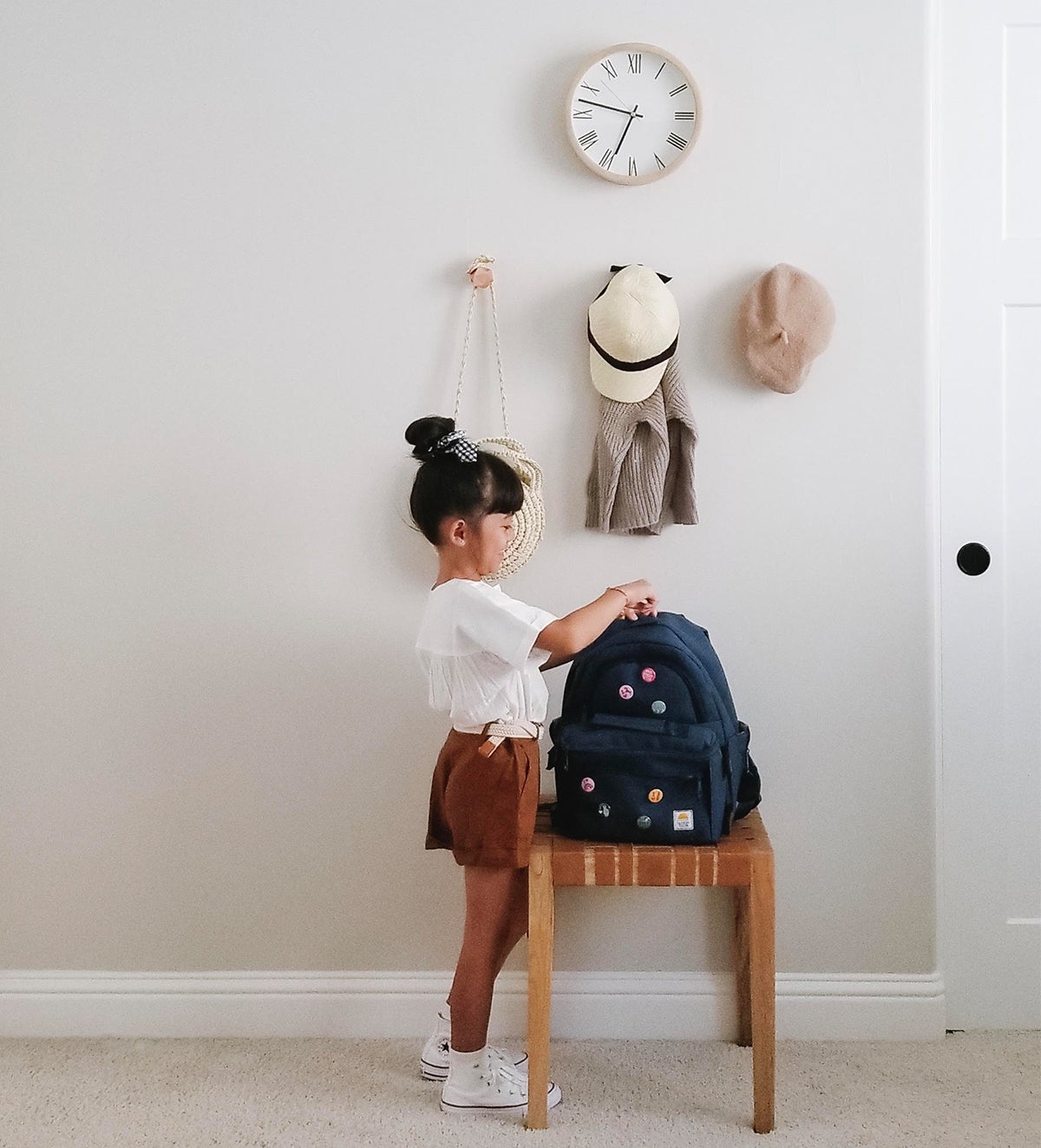
Look for inspiration in your everyday life, even in the mundane tasks and activities. Bespoke organization can bloom from habitual decisions — including those as small as where we tend to take off our shoes or leave our coat at the end of a day. Placing those most functional elements with intention can inspire a completely original display in that which isn't a display at all.
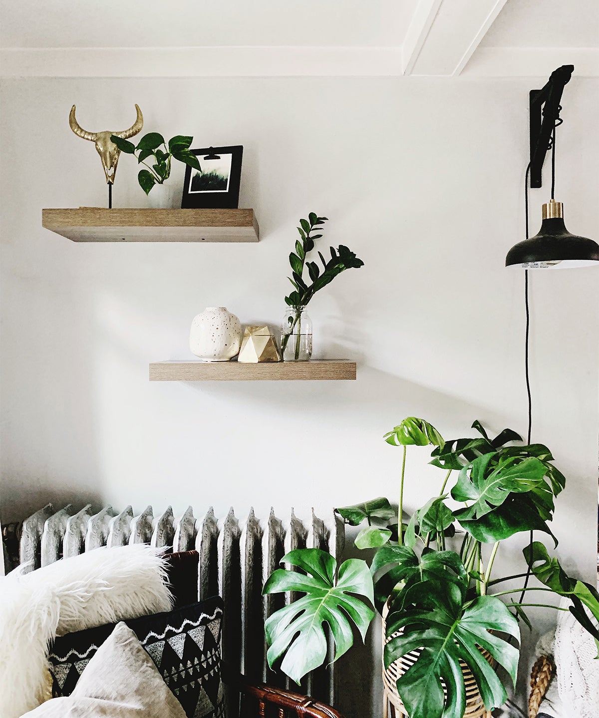
Aim eye-high by leveling up your accessories from tables and stands to floating shelves. Bringing those pieces off your counters and into your vantage point helps give them the platform (and attention) they deserve — all the while avoiding an overcrowded bookshelf or mantle. Take a page from our friend @kellybananatree, who took extra care to create balance by coordinating the colors of well-placed props.
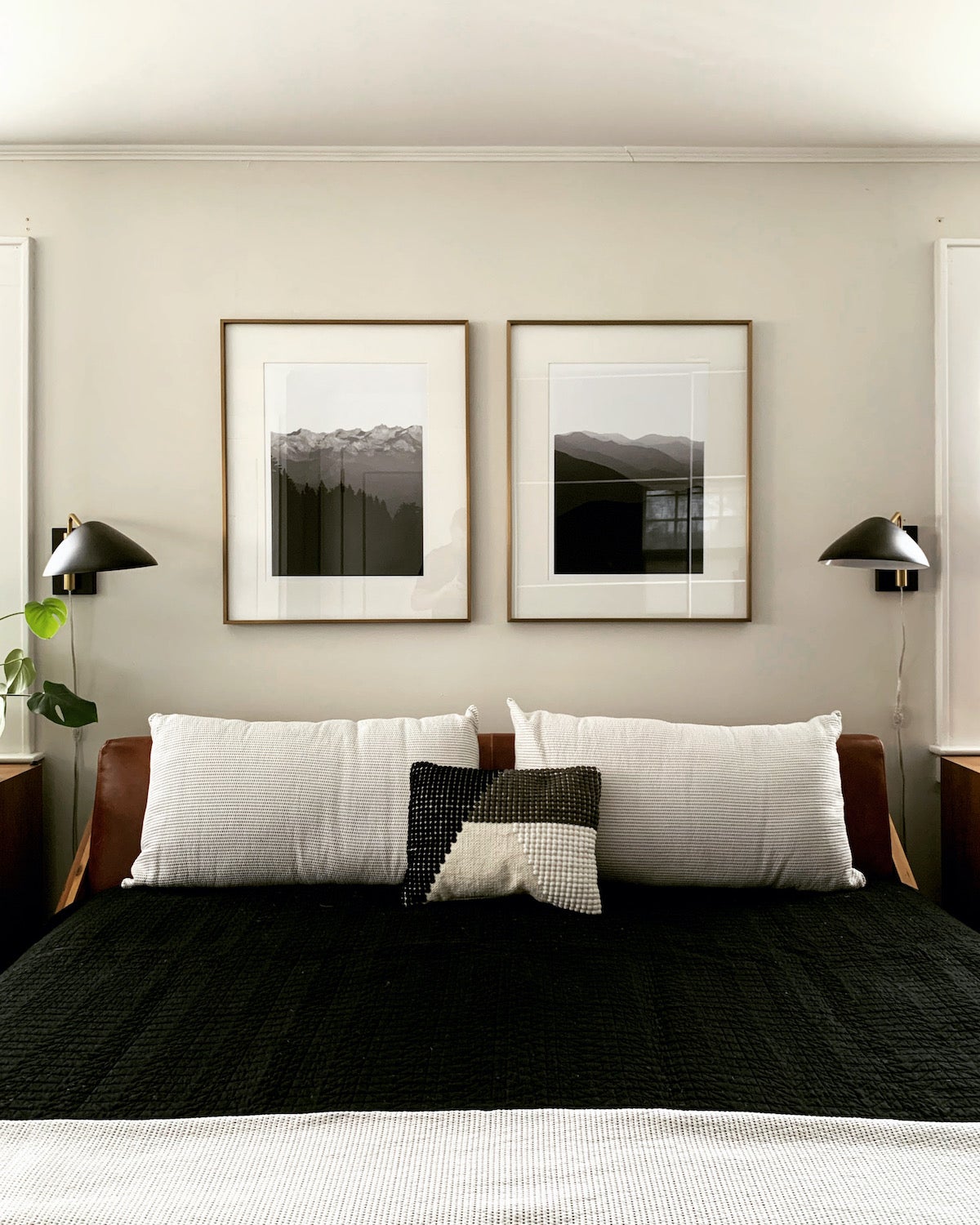
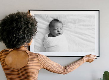
In bedroom decor and beyond, your photos are what truly makes a space feel like its yours. These moments preserved are sources of color and personality in minimalist room design, making an especially poignant impact when displayed in just the right way. Whether it's a series, a seamless triptych, or that larger-than-life statement piece, it's an opportunity to tell the stories that define your home and capture what matters. Go big and don't look back.
Mind the Design
Make These Minimalist Room Ideas Your Own
If you do, we'd love to see your take! Just tag us on Instagram (@artifactuprising).
