There's nothing quite like holding the album you envisioned in your hands. But the thought of designing it can feel a little scary, especially when you're just getting started. After all, every moment-marker wants to give those meaningful stories their due! Luckily, with a few simple tips in your back pocket, a beautiful photo book is more than achievable.
That's why we've called in a little help from the experts on our Design Services team. Read on for the tips they use every day to make dream albums a reality.
Feeling overwhelmed?
Let us design it for you.
Save time by having one of our expert designers create an album you'll come back to often.
Learn MoreIdea 01 | From Morgan
Start with a vision in mind.
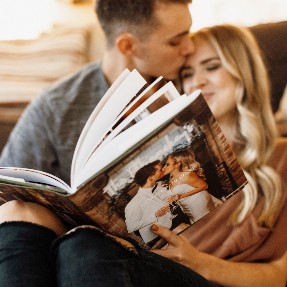
Photo by @hannahobremskey
What do you want the album to portray? What emotion do you want someone to feel as they flip through? Develop a vision for your album before you begin, and let it serve as your north star for every decision. I personally love when customers give details about their big day, trip, or event — whether they say '"we love to laugh and have fun together" or "we like a more dark and intimate vibe, rather than bright and airy." Your personality and the mood of the event flow into your book through the more you stay true to them through the small details.
Below are two of my favorite ways to bring that vision into your creation.
Choose photos that are authentic to your vision.
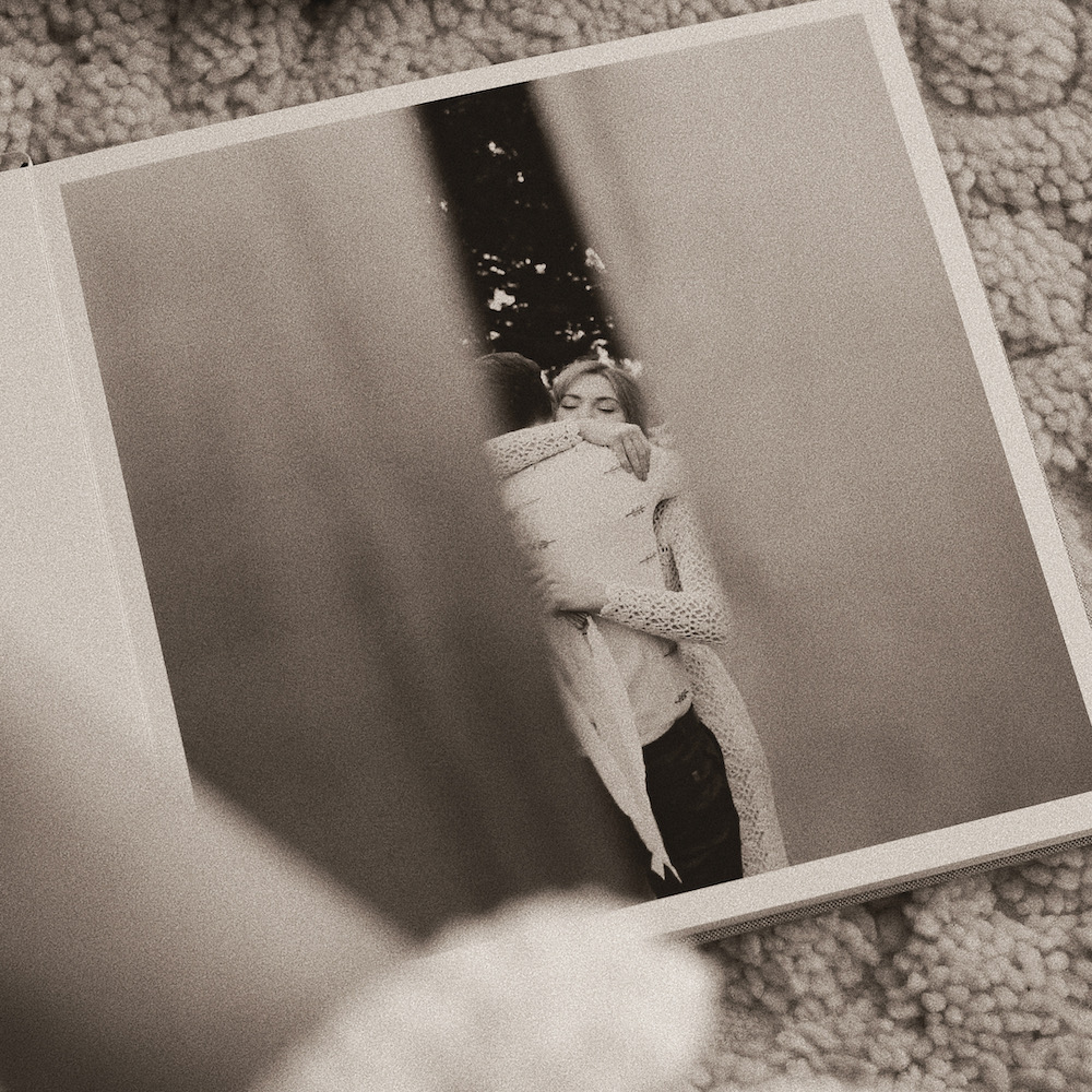
Photo by @prettylittlefawn
Some of the dogmas around "photos worth printing" can lead you away from your vision. But maybe perfectly-posed photos aren't really your vibe? At the end of the day, a photo isn't a must-have unless it moves you! For some people or events that might mean silly candids, while for others it might call for a lot of scene-setters and magical little moments.
Create consistency using filters or presets.
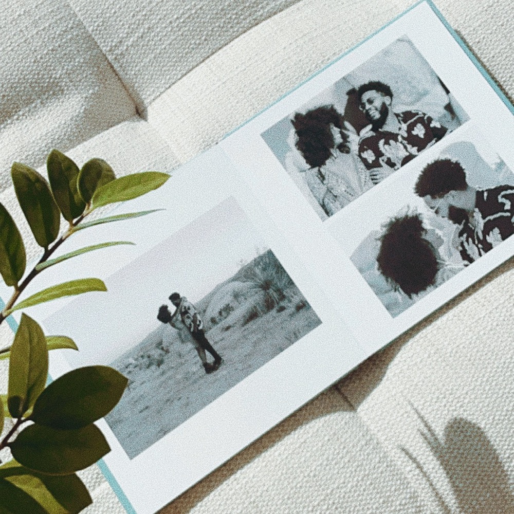
Photo by @reallyjsmn
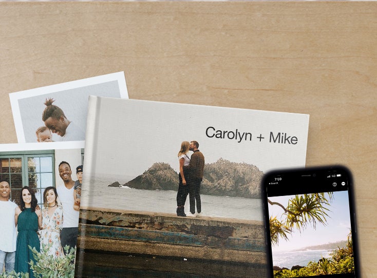
Creating a unified aesthetic in your photos might seem difficult if you're not a photographer. That's where Lightroom Presets, VSCO recipes, or even the filters in your native iPhone editor can come in handy. Applying them brings a sense of consistency to the tones and other elements of your images, so there is a common visual thread that appears in the album. Make sure the presets you select are in line with your vision! We recommend choosing more subtle options that create consistency without distortion.
Idea 02 | From Elyse
Simplify the way you select images.
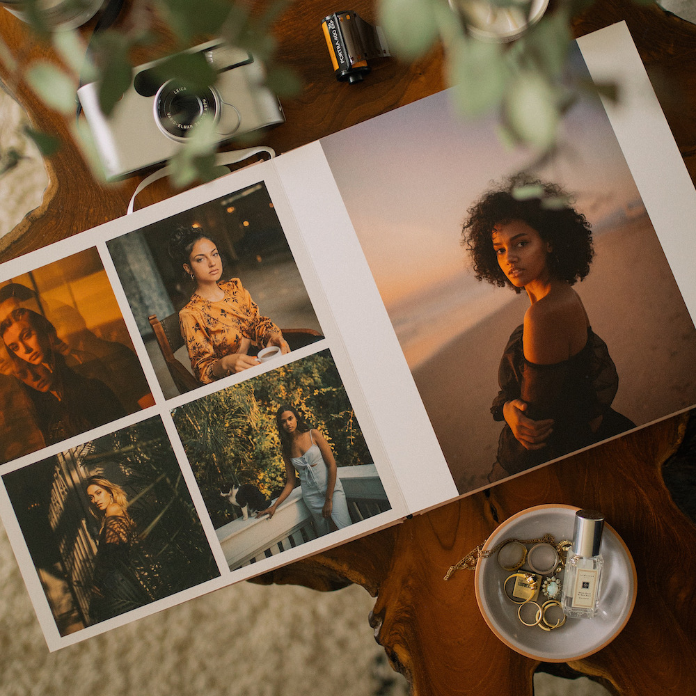
Photo by @blackprints
Unless you're in the habit of regularly organizing your photos, the biggest hurdle comes at the very beginning of the process for most people. It gets even harder when albums cover multiple events, months, or years. So I wanted to share two approaches that I've found to be really helpful for choosing images from your camera roll:
Give yourself space to relive stories.

Photo by @thegrowingseasons
Time and perspective are the keys to choosing the right photos for your album and making it enjoyable. Remember, looking back through photos should be a lot of fun! If possible, set aside a portion of a mellow weekend day or similar chunk of downtime to let yourself relive the stories behind the images. (Don't forget to "favorite" the memories that really tug at your heart strings!) By giving yourself this space, you'll find that the selects worth highlighting come to the surface along the way.
Start small with specific trips or events.
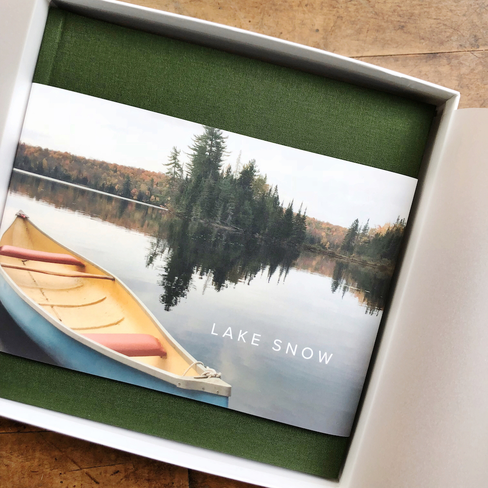
Photo by @sam_angermann
Narrowing down just a few dozen or hundred images from thousands can admittedly feel daunting. Starting small with specific trips or events can help you break the cycle of stress scrolling. Plus, your camera roll or desktop folder is likely already grouped chronologically — even if you don't create galleries on your phone. Begin by choosing a few images from one event, and as you move to the next, you'll have the boost of momentum you need to keep moving.
Idea 03 | From Kate
Lay things out in categories.
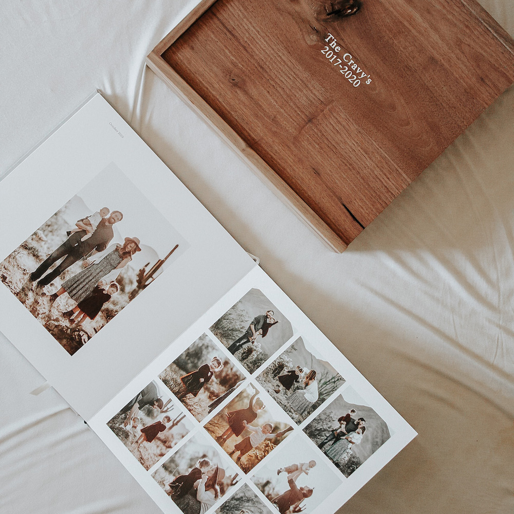
Photo by @tealacravy
Once you have your curated photos in hand, it's helpful to develop a general sense of how you want to categorize them. These categories then become "chapters" of the story, if you will — and it can go a long way in helping add your photos to the album, lay them out, and piece your story together.
Pick between 2-15 of your absolute favorite photos for each "chapter" and don't be afraid to be a little ruthless in playing favorites. You can always go back to your photos and pick new ones! Just as importantly, make sure to include images of the little details that help give context to the hero moments. (We even have a guide we created to take you through the process, spread by spread.)
Here are a couple of examples to help give you an idea of how categories might shape up for common types of albums:
Wedding Albums
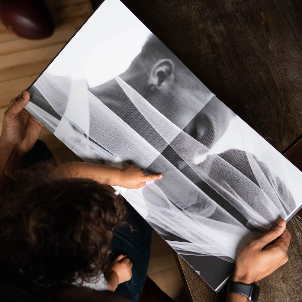
Photo by @ca.pt
- Details
- Getting ready
- First look
- Ceremony
- Family photos
- Cocktail hour
- Reception
- Toasts
- Dance floor
- Parting shots
Travel Book
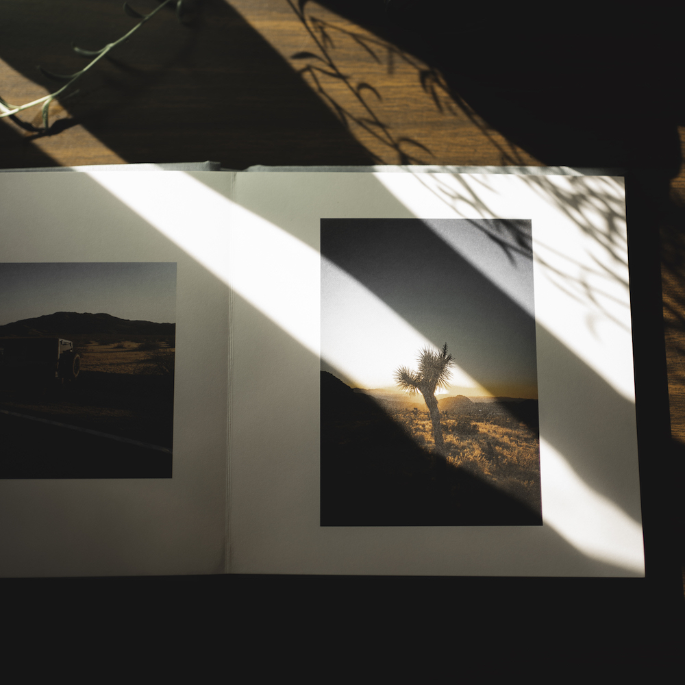
Photo by @aokimatsu
- On the way
- Scene-scetters
- Candid shots
- Little details
- Special meals
- Major experiences
- Travel buddies
- Going home
Idea 04 | From Kally
Choose layouts that elevate your photos.
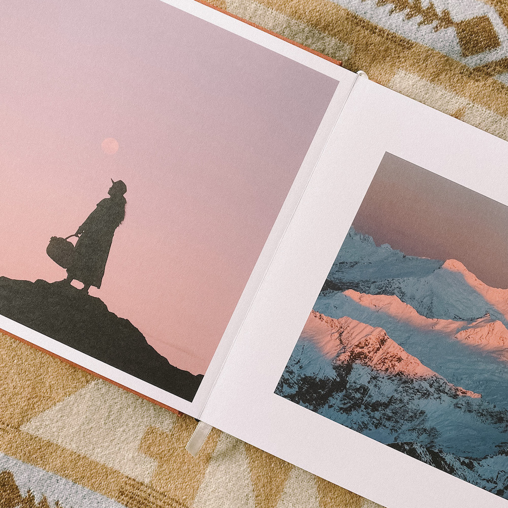
Photo by @em_space
The photo book layouts you choose and the way you use them to showcase your stories has a big impact. Sure, not everyone considers themselves a designer. But just like many skills, keeping a few best practices in mind can get you a lot further than you might think.
Give big moments their own spread.
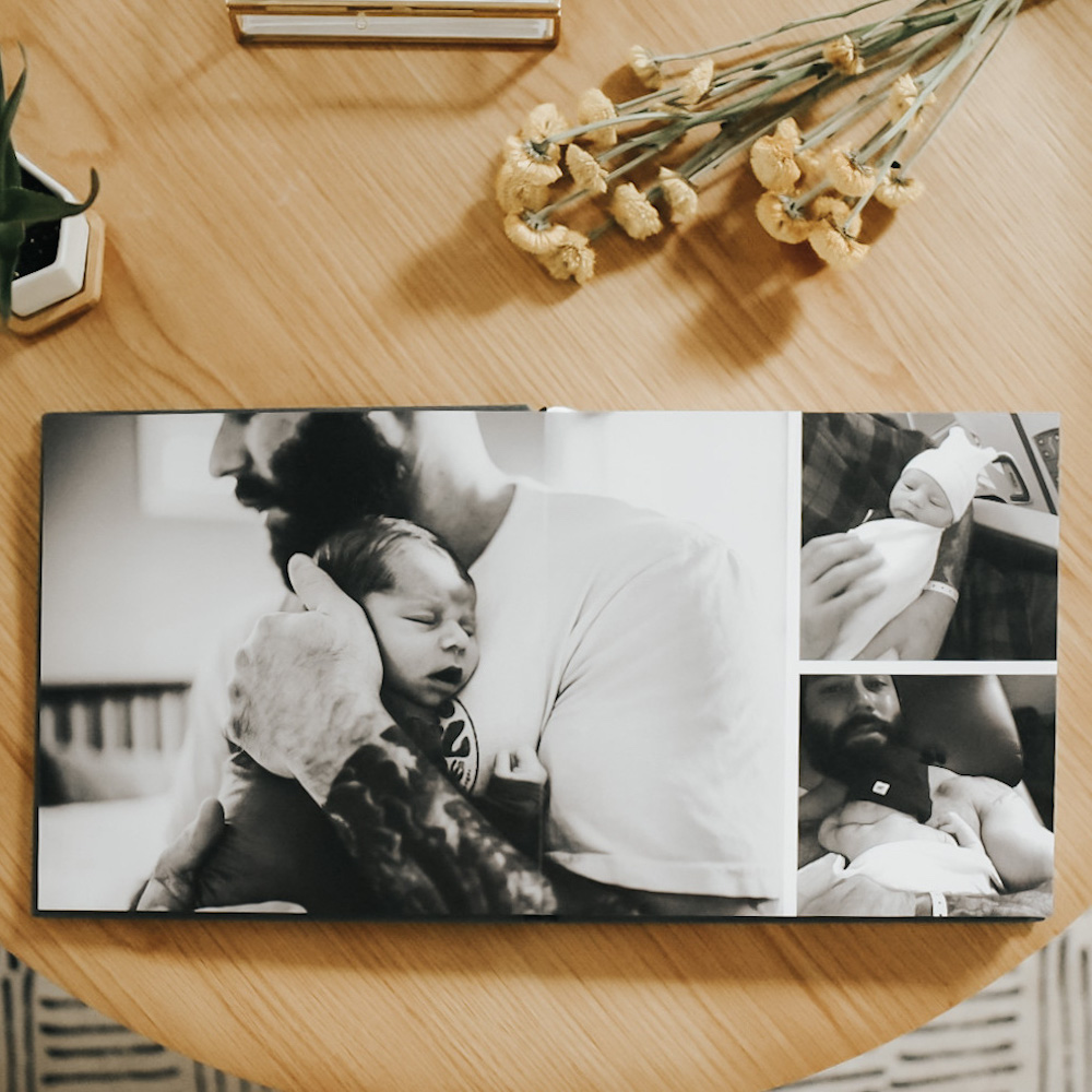
Photo by @whitmargolis
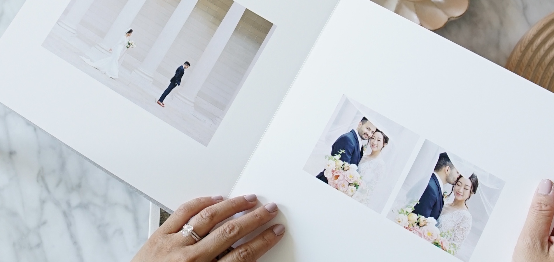
How can you use layouts to relive the moment in one spread? One tried-and-true way to approach this is to use a layout of smaller photos on one page and pair it with a single hero image on the other. This is especially impactful in a Layflat Photo Album, and the story will tell you which layout and photos belong on which page. For instance, photos of your first kiss as a married couple might call for the spotlight treatment on the left page, while the candid moments unfolding after would go on the right.
Create consistency using filters or presets.
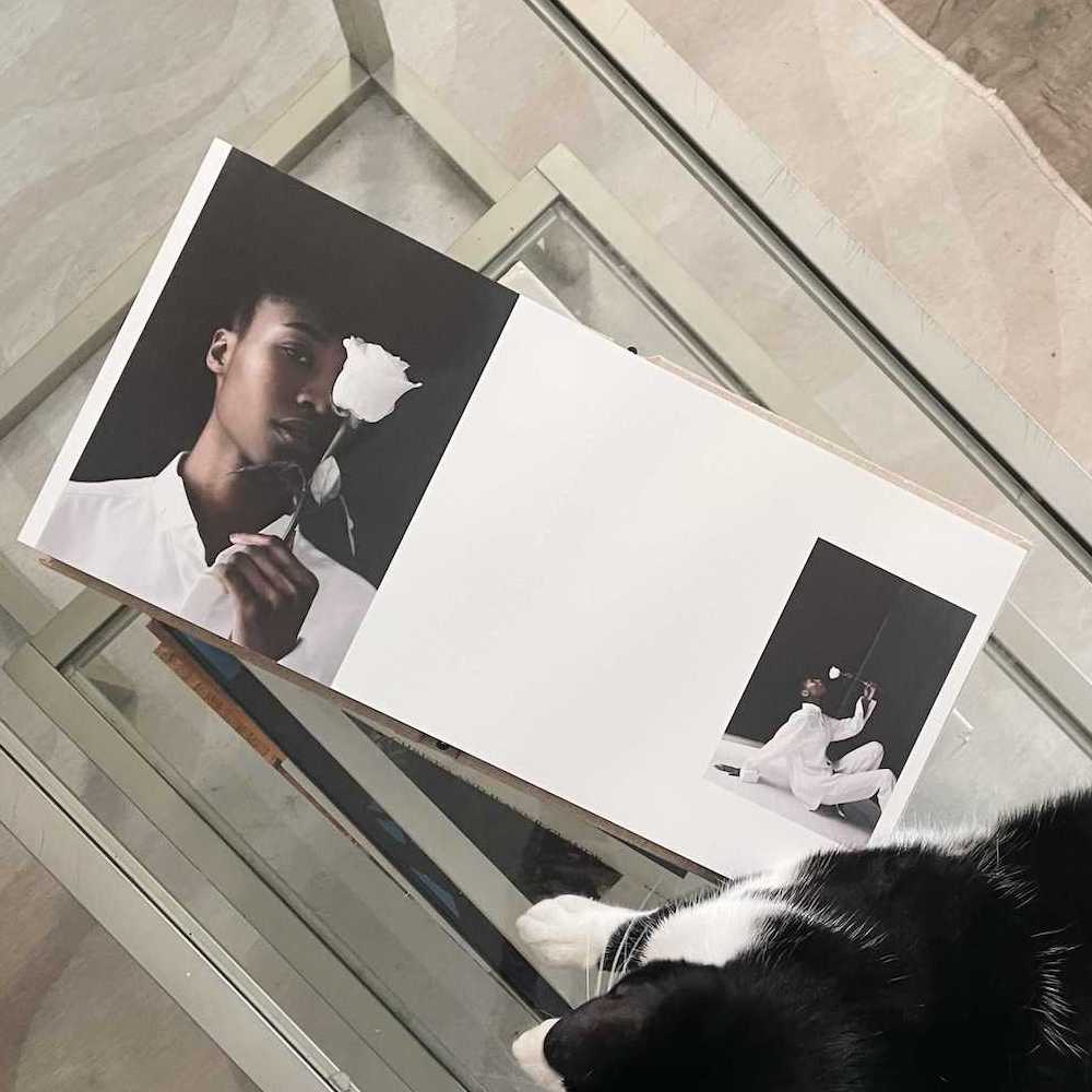
Photo by @mollysolorzano_
Images draw the eye in when they have negative space around them. If you try and fit every photo you can into the least space, some of your favorite photos are going to get lost in the shuffle. That's not to say that you can't have a layout with lots of photos. It just might call for more white space on the next page or spread. As long as things are feeling well-balanced, you're probably on the heels of something great!
